A successful brand identity is a logo that communicates ideas in an original way. It must impact potential customers and hold their attention. Here is a list of 20 creative logos I made in last years:
 Game Over is a série de vidéos YouTube on video games. I based my logo on the famous "directional cross" of video game controllers. This one is covered by the rest of the letters, leaving only the arrow of the top and the bottom (representing the successes and the fails of certain clips). The bottom arrow turns red, to represent failure. I wanted this logo to be included in a form (here a circle) because I imagined it at the same time as the introduction in motion design. More details
With my friends studying at ECITV, we have created an audiovisual production companie named "Clameur", which was used to sign most of our student projects. So I took care to create a logo and a graphic, with which we communicate on our production files and on social networks. More details

Infinite Pulse was a new kind of live streaming platform. Our platform offered streamers to push the boundaries of the livestream and to discover tools adapted to the content they broadcast. With a friend of mine, we put together this project from A to Z, and I took care of all the graphic identity of this project. The inspiration of this logo comes from the representation that makes a pulse. More details
![]()
Un logo suivant la tendance de écobranding ! Fait de « contours » plutôt que de formes pleines, son design aura un impact écologique et économique moindre, réduisant ainsi grandement les coût d’impression et l’impact environnemental de sa marque ! More details
Canap 'on the Rocks is a game show concept made in live for the web and which can be re-broadcasted on a conventional television format. After conceptualizing a live show for Live 124 with my group, I took care of the creation of the graphic universe, the logo and animation of it in motion design. More details
Happy Seine is a Facebook page making videos about the Seine (the famous river crossing Paris). I took care of the artistic direction of the videos and the logo: I proposed a new logo with a complete graphic charter. The colors of the logo range from royal blue to turquoise to remind the color of the Seine, highlighted by a wave reminiscent of a stream. The A is a bit curved to remind the Eiffel Tower. More details
After various creative logo propositon, I have created this final logo for the ISC Digital School, a new school that have been created by ISC Paris. I designed a graphic charter and I applied it in a presentation brochure and in a motion design. More details
![]() Second proposal of logo for Alpha, the new association of the ISC Paris destined to the school promotion. This version is more flat, and more general. It adopts the codes of the web and the sportwear, with a typo in tiny very modern.
Second proposal of logo for Alpha, the new association of the ISC Paris destined to the school promotion. This version is more flat, and more general. It adopts the codes of the web and the sportwear, with a typo in tiny very modern.
Discover the final version of the logo by clicking here.
Fictitious logo as part of a student project, to imagine a 100% natural hotel, whose specificity is that it is located near a volcano.

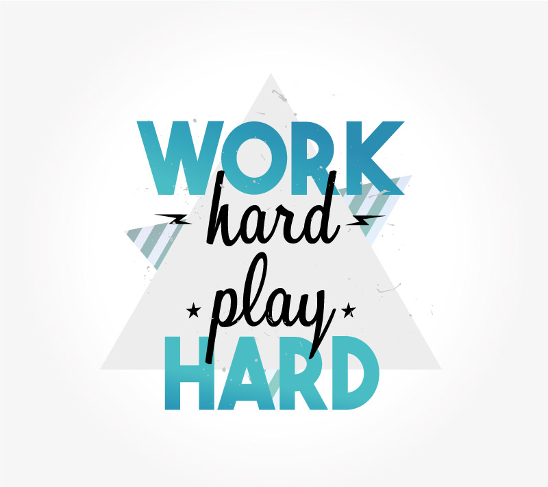
At ISC Paris, there are recruitment periods where people who apply for the Master pass oral exams. They must therefore be welcomed and feel accompanied. So I was asked to make a special logo for the occasion called "Work Hard Play Hard". Here is one of the proposals I made to them. The style is quite young and offbeat, with cool colors reminiscent of summer. More details
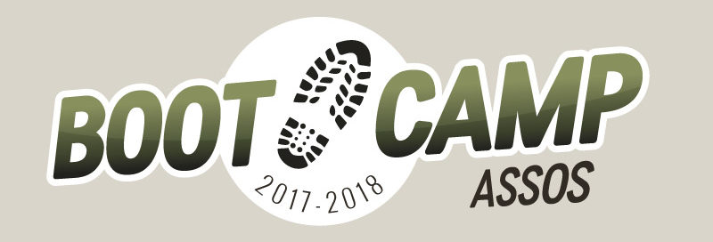
Because of the changes of the presidents of the associations of the ISC, new associative managers arrive in position and are brought to receive training on a week (in the manner of a bootcamp). So I was asked to make a logo for the occasion. I kept a very military style (as much in terms of colors as the brand of rangers). More details
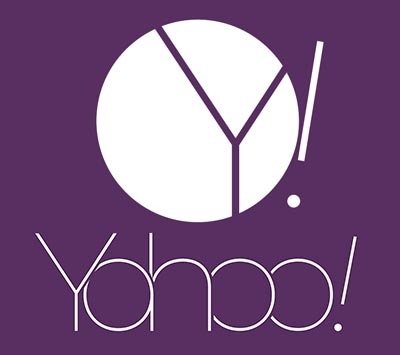 When I was in my Bachelor year at Digital Campus, we had an exercise that consisted of proposing a new logo for the famous Yahoo company. The instruction was that the logo had to be much more modern. Here is the proposal I made. The letters are very rounded and have a very fine fat. They get tangled together to almost all look alike and give a sense of unity. More details
Still at Digital Campus, I had an exercise that consisted of proposing a new logo for the "Aquarium du Grand Lyon" which was getting very old. Here is the logo that I offered them: colors reminiscent of the sea, a "a" shaped water swirl that can be declined in square logo. More details

 The Zero Gravity is a clan of players playing video games while filming their games, to replay the best moments (often the funniest) in YouTube videos. They have 70.000 subscribers today. I took care of the graphic charter and their logo. This one is quite gray and metallic, but contrasts all the time with a background of purple color (and some blue and pink lights). I also animated logo in a video introduction. More details

DAB is a TV show pilot that we produced for the MCE television channel (Ma Chaîne Etudiante). I created the logo and its animation in motion design for the credits. This one wants to be very simple, black on a white background, and recalls with the A, the position that takes the arms of the people who make a DAB. More details
Boîte de Pandore (Pandora's Box) is a fictional advertising agency, specialized in the creation of audiovisual content positioning itself on the high-end eroticism market.
En effet, celle-ci a été créée lors d’un séminaire de Digital Marketing réalisé à l’ECITV durant ma 5ème année et je me suis occupé de la création du logo de l’agence. More details

Every year, during the local festivities of Mimizan (a french small city), people who are 20 years old this year are invited to join an association. This one will have to organize events, evenings and animate a "bodega" (a temporary bar) during the celebrations. The association needed a logo, here is the one I realized. It represents the spirit of the holidays and the region: The waves for the beach, the pine for the region, the revelers dressed red and white and of course, the beer. This logo was then embroidered in red sweaters that each member of the association wore. More details
On the occasion of an event organized at ISC Paris, rewarding the best prepas in certain categories, I had to create a logo. invitation.
 Jerry Ghetto is a web-series telling Jerry's offbeat life, a young adult who is out of step with his environment. I took care of the creation of its logo and its graphic identity. More details
Creative Logo Творческие Идеи Logo Inspiration Дизайн Ногтей Логотип Брендинг Логотип В Стиле Минимализм Дизайн Бренда Графический Дизайн Вдохновение Графика
These are genuinely impressive creative logos ideas. Claudine Tobin Nester
Categories
Comments